Introduction
At Epimorphics we help public sector organisations publish their open data. One of my roles in that work is sometimes to help understand the data and we are also increasingly exploring options for building visualisations and analytical user interfaces over and across data sets.
For quite a while I’ve been meaning to take a look at Tableau Public as simple way to create publicly accessible interactive visualisations over open data sets – especially those like ours that are accessible via an API (Application Programming Interface).
Editor’s note: This post now forms part of a series exploring in more detail the use of Tableau for visualising linked-data. For more in the series see: Getting Started (Part 2), Data Connectors (Part 3) and Summary (Part 4).
Tableau
Tableau Public is a free to use online data visualisation tool. Users can create and share open data visualisations. It can import data in many formats including spreadsheets (e.g. excel, Google Sheets, csv), data-bases (Microsoft Access), and recently also json (Javascript Object Notation) files that can be obtained from many web data sources (APIs). However, it also has a mechanism ‘web data connectors’ that enables data to be imported directly via web APIs.
Trying Tableau
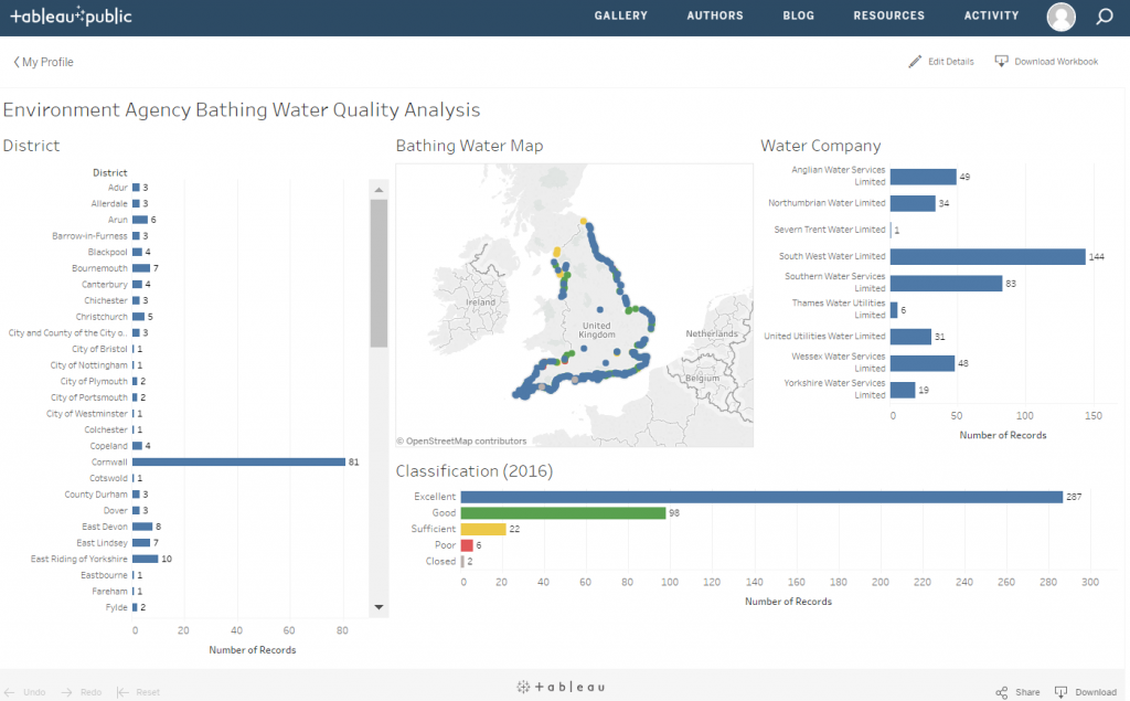
To try it out I decided to play with the Environment Agency Bathing Water Quality data that we host. There is a wealth of data available about each bathing water and there are some interesting aspects of the data that are interesting to interactively explore. The API also makes it easy to get core data.
The main image above shows the result of that initial playing. You can have a play with the experiment on Tableau Public here. It pulls in data about each bathing water – name, district (local authority), current water quality classification and water company (technically Appointed Sewerage Undertaker) from the API.
By clicking on a bar in the charts or selecting an area from the map the results will dynamically filter the results, e.g. show only Bathing Water’s with ‘Good’ classification, then filter again to only those in Cornwall, etc.
There are various ways to reset a chart selection (e.g. click on the bar again or in an empty area of a chart/map) or to reset the whole thing click the ‘reset’ link at the bottom left.
There are things I still have to work out, e.g. I designed it to be used on a desktop with a medium resolution monitor and the layout isn’t great on a lower resolution screen or small window. I’d like the page/viewing-area to be longer so that the ‘district’ and ‘water company’ charts don’t’ have to scroll to see all of the bars. But on the whole it’s been easy and fun to generate the visualisation and plenty of scope for future development – pulling in more data, changing the chart types, etc.
The Tableau Public web-site has a range of resources to help get started using it.
Creating the Visualisation
For those interested – I’ll write a future post that goes into more detail of how the data was pulled in and charts/dashboard created, but in summary:
- Install Tableau Public https://public.tableau.com
- The data is obtained via a single API call to the Environment Agency Bathing Water Quality API in – in json format, using a single API call: https://environment.data.gov.uk/doc/bathing-water.json?_view=bathing-water&_pageSize=1000&_page=0
You can view the data more easily by switching the format to HTML replacing ‘.json’ with ‘.html’ in the URL:
https://environment.data.gov.uk/doc/bathing-water.html?_view=bathing-water&_pageSize=1000&_page=0
- Set up the Tableau Web Data Connector SDK As a non-developer I found the Web Data Connector documentation a bit complex. That put me off trying it the first few times I took a look. However, once I got it setup – actually straightforward following the instructions – I soon realised I could just take one of their Web Data Connector examples, see what it was doing, and adapt it.
You will need to set up a local web server (I use Windows and have Python installed, so used python’s SimpleHTTPServer) to host the SDK simulator and the Web Data Connecter so that it can run and pull the data in.
Once it’s created the Web Data Connecter (consists of two files an HTML and a Javascript file) can be hosted on any server accessible from the machine where you are creating the visualisation using the Tableau Public application. That got me to having a local Web Data Connecter I could use to download and extract the Bathing Water Quality data I wanted
- In the Tableau Public application choose Web Data Connecter as the data source and put the URL of the Web Data Connecter’s HMTL file in the form. That downloads the data as with any other Tableau Public data source and from there it’s identical to using any other data in Tableau Public.
For more in this #TechTalk series see: Part 1 | Part 2 | Part 3 | Part 4